组件
1. 小程序中组件的分类
小程序中的组件也是由宿主环境提供的,开发者可以基于组件快速搭建出漂亮的页面结构。官方把小程序的组 件分为了 9 大类,分别是: ① 视图容器(常用) ② 基础内容(常用) ③ 表单组件(常用) ④ 导航组件(常用) ⑤ 媒体组件 ⑥ map 地图组件 ⑦ canvas 画布组件 ⑧ 开放能力 ⑨ 无障碍访问
常用的视图容器类组件
① view 普通视图区域 类似于 HTML 中的 div,是一个块级元素 常用来实现页面的布局效果 ② scroll-view 可滚动的视图区域 常用来实现滚动列表效果 ③ swiper 和 swiper-item 轮播图容器组件 和 轮播图 item 组件
view 组件的基本使用
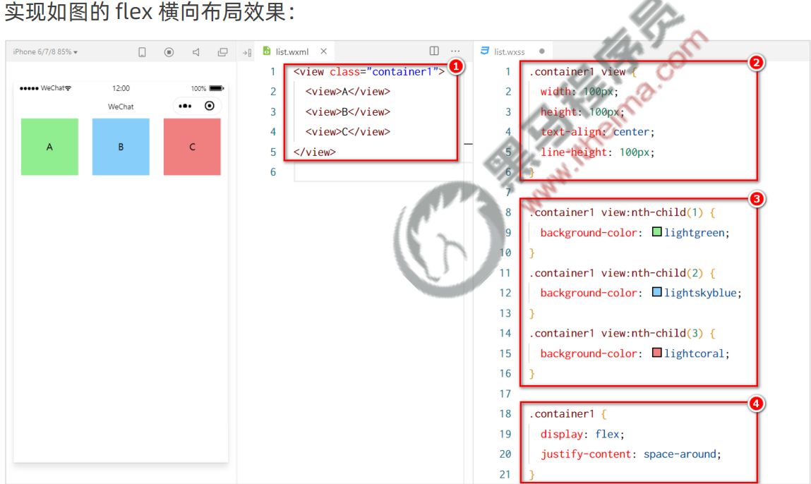
和html的div没啥区别 实现 flex 横向布局效果:
结构
html
<!--pages/a/a.wxml-->
<view class="container1">
<view>A</view>
<view>B</view>
<view>C</view>
</view>样式
css
/* pages/a/a.wxss */
.container1{
  display: flex;         /* display:flex(弹性盒子布局) */
  justify-content: space-around;/* 均匀排列每个元素,每个元素周围分配相同的空间 */
}
/*这里是类选择器和后代选择器 */
.container1 view{
  width: 100px;
  height: 100px;
  text-align: center;
/*text-align属性规定元素中的文本的水平对齐方式:center水平居中*/
  line-height: 100px;
/*行高,达到纵向居中*/
}
/*伪类选择器,第n个子元素:nth-child(n) */
.container1 view:nth-child(1) {
  background-color: aqua;  /*背景色*/
}
.container1 view:nth-child(2) {
  background-color: burlywood;
}
.container1 view:nth-child(3) {
  background-color: chocolate;
}view 组件的基本使用
scroll-view 组件的基本使用 纵向滚动效果:

结构:
html
<!--pages/a/a.wxml-->
<scroll-view class="container1" scroll-y="1">
<view>A</view>
<view>B</view>
<view>C</view>
</scroll-view>样式
css
/* pages/a/a.wxss */
.container1{
  border: crimson 1px solid;
  height: 120px;/*给scroll-view固定高度,要实现滚动效果,必须设置高度*/
  width: 100px;
  display: flex;
  justify-content: space-around;
}
.container1 view{
  width: 100px;
  height: 100px;
  text-align: center;
  line-height: 100px;
}
.container1 view:nth-child(1) {
  background-color: aqua;
}
.container1 view:nth-child(2) {
  background-color: burlywood;
}
.container1 view:nth-child(3) {
  background-color: chocolate;
}swiper 和 swiper-item 组件的基本使用
实现轮播图效果:

结构
html
<!--pages/a/a.wxml-->
<!-- 轮播图结构 -->
<swiper class="swioer-container" indicator-dots="true">	<!-- 是否显示面板指示点 -->
<!-- 第一个轮播图 -->
<swiper-item>
  <view class="item">A</view>
</swiper-item>
<!-- 第二个轮播图 -->
<swiper-item>
  <view class="item">B</view>
</swiper-item>
<!-- 第三个轮播图 -->
<swiper-item>
  <view class="item">C</view>
</swiper-item>
</swiper>样式
css
/* pages/a/a.wxss */
.swioer-container{
  height: 150px;
}
.item{
  height: 100%;
  line-height: 150px;
  text-align: center;
}
swiper-item:nth-child(1) .item{
  background-color: aqua;
}
swiper-item:nth-child(2) .item{
  background-color: rgb(101, 211, 116);
}
swiper-item:nth-child(3) .item{
  background-color: rgb(231, 102, 113);
}swiper组件的常用属性:
| 属性 | 类型 | 默认值 | 说明 |
|---|---|---|---|
| indicator-dots | boolean | false | 面板指示点的显示 |
| indicator-color | color | rgba(0, 0, 0, .3) | 指示点颜色 |
| indicator-active-color | color | #000000 | 当前选中的指示点颜色 |
| autoplay | boolean | false | 自动切换 |
| interval | number | 5000 | 自动切换时间间隔 |
| circular | boolean | false | 衔接滑动 |
常用的基础内容组件
text文本组件
类似于 HTML 中的 span 标签,是一个行内元素
rich-text富文本组件
支持把 HTML 字符串渲染为 WXML 结构
text 组件的基本使用
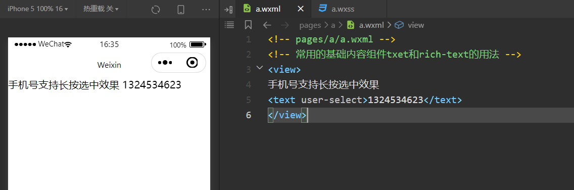
通过 text 组件的 selectable 属性,实现长按选中文本内容的效果:
结构:
html
<!-- pages/a/a.wxml -->
<!-- 常用的基础内容组件txet和rich-text的用法 -->
<view>
手机号支持长按选中效果
<text user-select>1324534623</text>
</view>rich-text 组件的基本使用
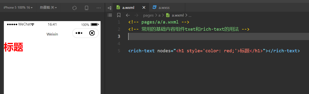
通过 rich-text 组件的 nodes 属性节点,把 HTML 字符串渲染为对应的 UI 结构:
结构:
html
<rich-text nodes="<h1 style='color: red;'>标题</h1>"></rich-text>其他常用组件
button 按钮组件
功能比 HTML 中的 button 按钮丰富 通过 open-type 属性可以调用微信提供的各种功能(客服、转发、获取用户授权、获取用户信息等)
button 按钮的基本使用
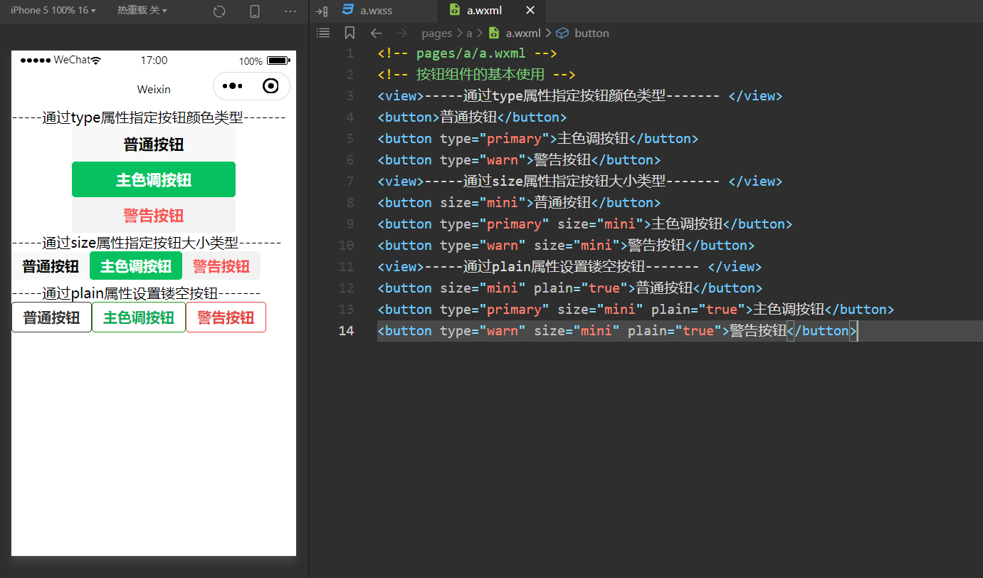
代码:
html
<!-- pages/a/a.wxml -->
<!-- 按钮组件的基本使用 -->
<view>-----通过type属性指定按钮颜色类型------- </view>
<button>普通按钮</button>
<button type="primary">主色调按钮</button>
<button type="warn">警告按钮</button>
<view>-----通过size属性指定按钮大小类型------- </view>
<button size="mini">普通按钮</button>
<button type="primary" size="mini">主色调按钮</button>
<button type="warn" size="mini">警告按钮</button>
<view>-----通过plain属性设置镂空按钮------- </view>
<button size="mini" plain="true">普通按钮</button>
<button type="primary" size="mini" plain="true">主色调按钮</button>
<button type="warn" size="mini" plain="true">警告按钮</button>image图片组件
image 组件默认宽度约 300px、高度约 240px
image 组件的基本使用
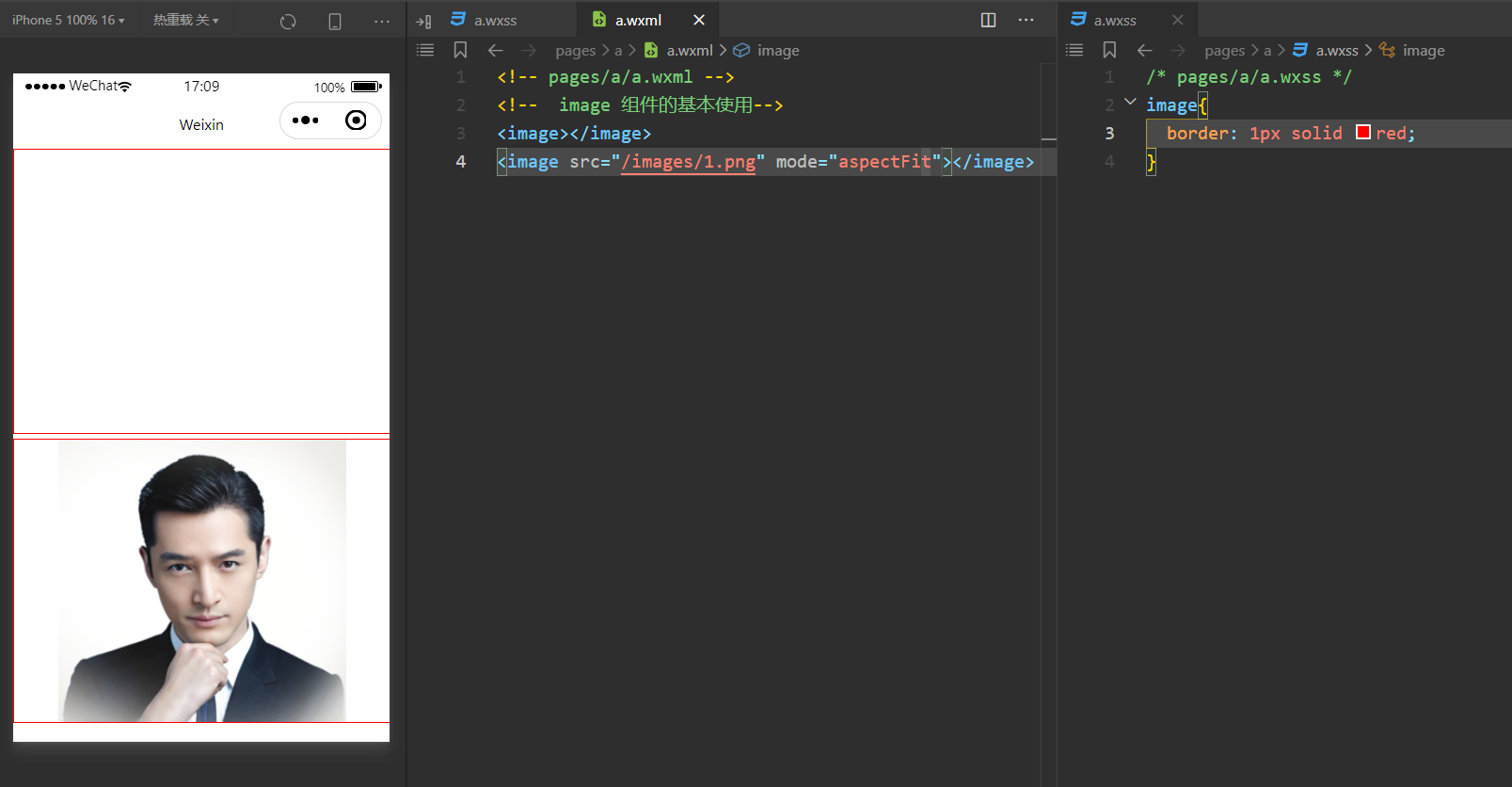
代码:
html
<!-- pages/a/a.wxml -->
<!--  image 组件的基本使用-->
<image></image>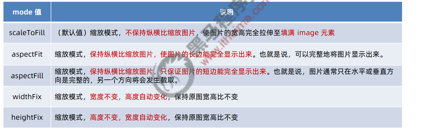
<image src="/images/1.png" mode="aspectFit"></image>image 组件的 mode 属性
image 组件的 mode 属性用来指定图片的裁剪和缩放模式,常用的 mode 属性值如下:
navigator(后面课程会专门讲解)页面导航组件
类似于 HTML 中的 a 链接